ShopDreamUp AI ArtDreamUp
Deviation Actions


Suggested Deviants


Suggested Collections


You Might Like…


Description
So Twist in the Night is ready for buyin' here [link] and my fellow contributors have been posting preview pages of their stories. I figure, why not I?
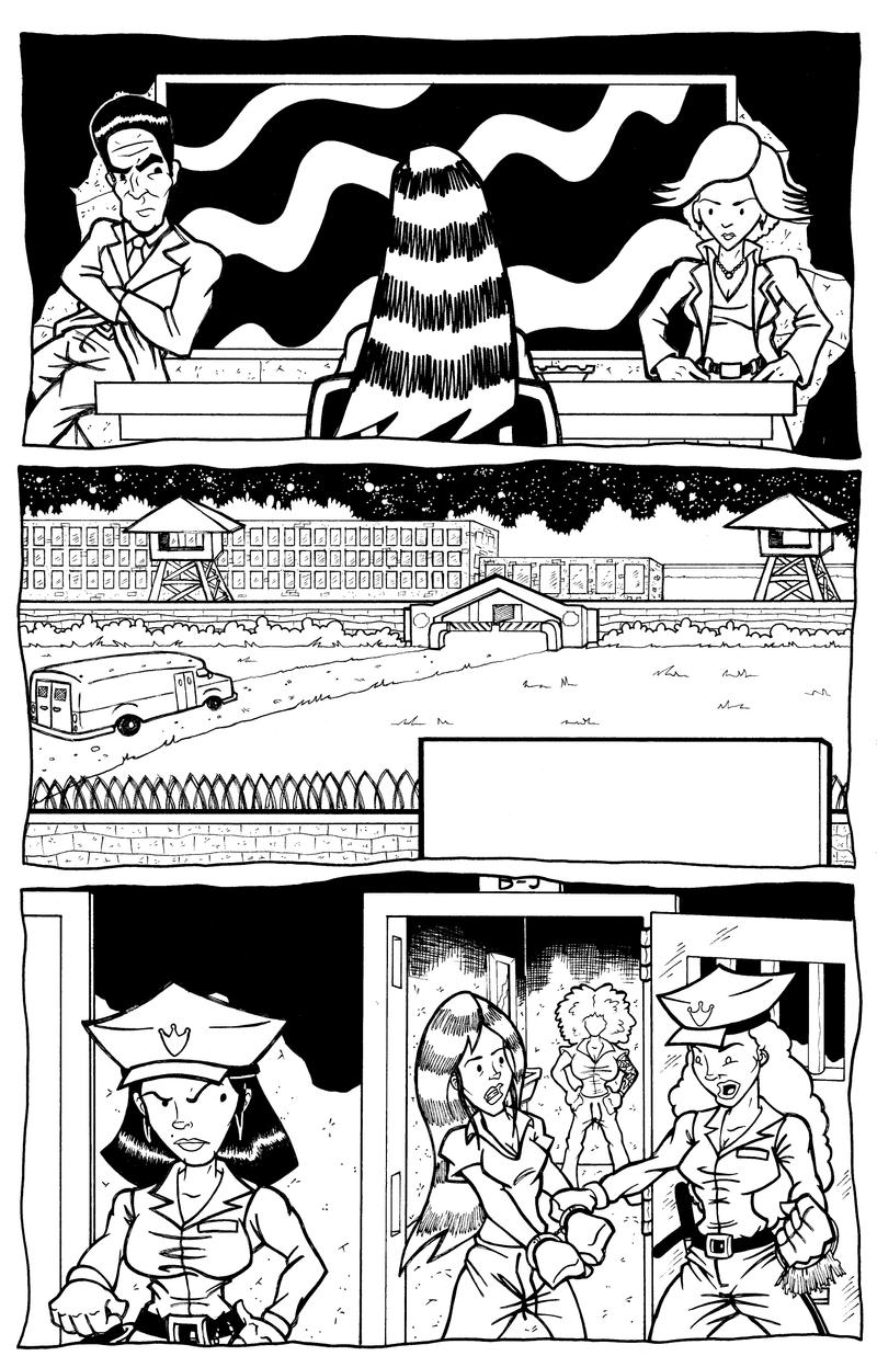
This here be page 1 from "Still Born" my terrorized women in prison story, co-written by and myself, and drawn by I. Not a lotta action here, but I does have that scenic view of the prison in that there second panel. Lots and lots of mistakes to be seen here, but what can you do? I did it, it's done, now it's time to move on. Hope ya'll enjoy it just the same.
This here be page 1 from "Still Born" my terrorized women in prison story, co-written by
and myself, and drawn by I. Not a lotta action here, but I does have that scenic view of the prison in that there second panel. Lots and lots of mistakes to be seen here, but what can you do? I did it, it's done, now it's time to move on. Hope ya'll enjoy it just the same.Image size
3301x5102px 4.36 MB
© 2009 - 2024 thatjuniorbruce
Comments10
Join the community to add your comment. Already a deviant? Log In
Wow, your work has improved a lot... Granted, the last one I remember looking at was a concept sketch, but at the time you were saying that you weren't an illustrator, so...
Anyway, this is pretty good. Excellent job in particular on the perspective view of the prison in panel 2. Places where you could improve. In general I think the guards' uniforms have a few too many wrinkle lines -- looks busy. The first frame is closer to what you want. A couple here and there are good.
I noticed you didn't draw the face on the girl in the background in the cell in the 3rd frame, which is good, although that character still has a bit much detail at that distance from the camera. At that distance she shouldn't have any clothing wrinkles. Tattoos are kind of iffy too -- maybe a hint of tats, but she should be almost a silhouette at that distance. This is something that I've been kind of struggling with recently since I've been illustrating digitally on my new tablet notebook. I tend to want to take a copy of a character who's closer to the camera in Illustrator and scale them down to move them into the background but then I don't remove enough of the details.
Oh and good layout and perspective concepts for these three scenes and the page. I might have turned the first scene around and shown the interrogators leaning in toward her so you could see her expression, but this works nicely to give that uncomfortable feeling.
Hair seems to be one way or the other, either it's really well done or it looks really off. I can relate, I have a love-hate relationship with hair. The guards in the last panel are great. What looks like the main character in this page seems off, along with the female interrogator in the first frame. The male interrogator looks a little odd only because his head looks a little long and the hair at the top is a bit wider than the rest of his head. It makes him look a tad-bit eraser-headed, but it's less noticeable than the others.
Incidentally, great posture for the interrogators. Little less clothing wrinkles in the guy's crotch - but other than that, clothing wrinkles in the first frame look pretty good.